Keys to success in Painting
These are keys not laws. There are always exceptions. However, I have found these principles useful. Feel free to offer feedback.
- General to Specific. Focus on capturing the big shapes of value and color across the entire image versus getting to specific or detailed oriented early on. Keep in mind the hierarchy of illusion (drawing>value>color>edge). I believe that the painting actually starts once I have paint on the entire panel. You can end up wasting a tremendous amount of time getting too detailed on one section too early (often small sections painted in isolation may need to be moved or altered once the rest of the image is painted.)
- Blurry/Soft to Sharp. I like to think of the entire painting coming into focus with each subsequent layer of paint. Once the paint is dry, It is far easier to make a blurry edge sharp than a sharp line blurry. Remember curved volumes (spheres, eggs, cylinders, balls etc) will always have an edge that is a little soft. Also, it is nearly impossible to blend an edge if both paints are not wet.
- Paint Shapes not Objects. Paint shapes of color and value; don’t name the object that you are painting. I encourage you to look for shapes within objects versus creating an edge around an object and filling in. Often times edges of objects may “disappear” entirely or shadow areas on object may meld into the cast shadow. Do not paint edges that don’t exist. If you are naming/painting objects you are more likely to be painting symbols and less likely to look at the larger relationships within the painting.
- Fast to Slow. That is the pace of the painting. The initial block in is to establish 1. The Drawing 2. Value structure. 3. Possible hints at color. This should be a relatively quick process but no a careless one. I usually do this with a larger bright and spend plenty of time stepping back and squinting my eyes to see if I am matching the bigger shapes in the composition.
- Back to Front. Try to think about the objects 3 dimensionally especially on the second and 3rd Within the object paint back to front. I always paint the edge of the background at the same time as I paint the object and work from the edge inwards. This allows for me to keep my edges soft (k2) and encourages me to paint “through the object” (K3).
- Dark to Light. In oil paint it is a more instinctive and easier to paint light over dark. In conjunction with painting back to front(k5), I will paint the dark outer edge of an object slowly moving toward the highlight last. It is a normal beginner mistake to go too light too early, then ask if there is any “super white” for your highlights because the “regular white just isn’t showing up.
- Cool to Warm. Cool colors recede into space and are often found in the background and shadow areas of the paintings in your darks. Warm colors move forward in space. Each color has a warm and cool version. For instance Alizarin Crimson is a cool red and would be found in the shadow side of a red ball and would transition into Cadmium Red which is a warm area which would surround the area around the bounce light (highlight)
- Paint with your body first…fingers last. In the beginning, stand back from the painting, and hold the brush at the far end, painting with your arm and body. As the painting progresses, you may need to get closer to your painting and paint more with a “handwriting” grip using your wrist. This encourages the paintings in the beginning to be general, fast, blurry and focused on big shapes not objects.
- Paint Fat over Lean. Fat over lean means that each succeeding layer of paint should have more ‘fat – oil’ than the preceding layer. If you are painting in an indirect method (working in layers rather than all in one go – alla prima) you need to adhere to this rule to prevent cracking.
- Enjoy. Try to be excited with what you are doing . . . Creativity happens when you make something exciting out of something boring.
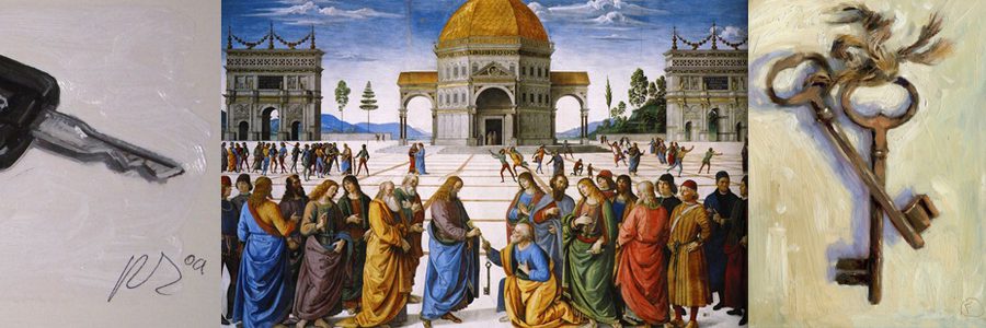
Banner artists in order from left to right
1. Detail from painting, Office Board for Smith Brothers Coal by John Frederick Peto
2. #364 Car Keys, Dan Young
3. Delivery of the Keys to St.Peter, Perugino
4. Two Old Keys, Nigel Fletcher
5. The Keys to My Heart, Ken Powers


2 Comments
I am familiar with “fat over lean ” as it relates to the “color stages “…however you didn’t elaborate on the under-painting or value study. Also, is it advisable to use a retouch between the two steps? And what is the best way to make a change?
Lean is in regard to the amount of oil in the actual paint or medium that is added to the paint. Certain paints are by their very nature more lean than others. For instance the old masters all used lead white as their ground and for their initial stages of the painting. Lead white is incredibly lean thus making an excellent base for the following layers. I hope that clarifies things.